SquareLayout
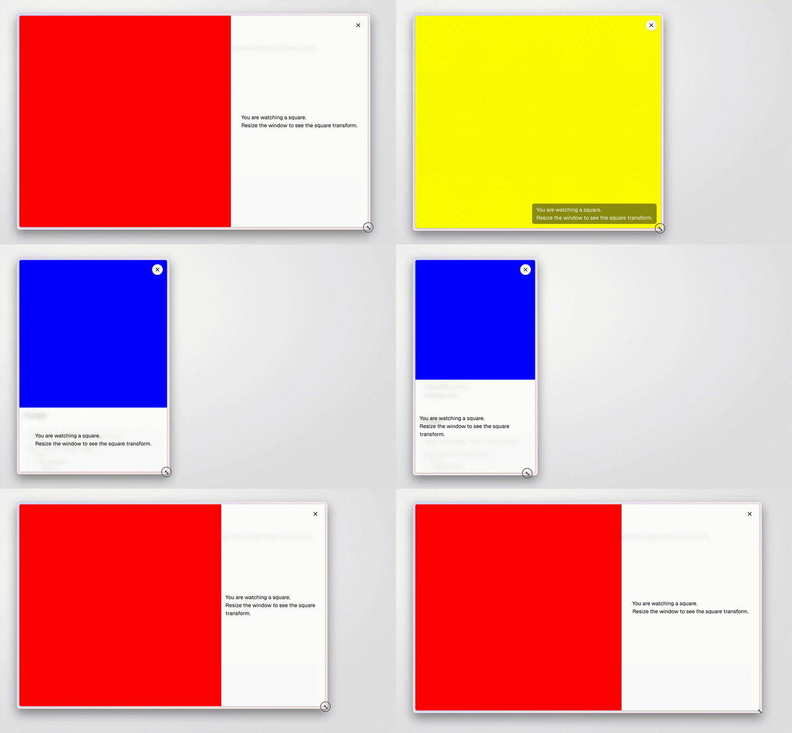
Responsive full screen layout to show something that's square, and have remaining space for text, except on square screens where text floats on top. Features adaptive design, responsive breakpoints, and optimized layout for different screen sizes.
v0.0.1
🍰
🏃
🎓
SquareLayout

A responsive layout component that creates a perfect square with text overlay. Perfect for showcasing images, videos, or any content that needs to maintain a square aspect ratio while displaying text.
Quick Start
import SquareLayout from "./square-layout";

export default function Page() {
  return (
    <SquareLayout wideBreakpoint={1.6} narrowBreakpoint={0.7}>
      Your content here
    </SquareLayout>
  );
}
Demo
Try it:
Examples
Basic Usage
<SquareLayout>
  <img src="your-image.jpg" alt="Description" />
  <p>Your caption or description</p>
</SquareLayout>
With Custom Breakpoints
<SquareLayout
  wideBreakpoint={1.6}  // Switch to wide layout when width/height > 1.6
  narrowBreakpoint={0.7} // Switch to narrow layout when width/height < 0.7
>
  Your content
</SquareLayout>
Details
- Title: SquareLayout
- Author: Mangle Kuo
- GitHub: ghcpuman902
- Tags: css, responsive, tailwind, react
- Version: 0.0.1
- Complexity: beginner
- Category: layout